
Eurasia Architectural Products
Year
2025
Sector
Architecture & Planning, Interior Design
Services
Mood Board
Colour Palette
Typography
Primary Logos
Alternative Logos
Front End Development
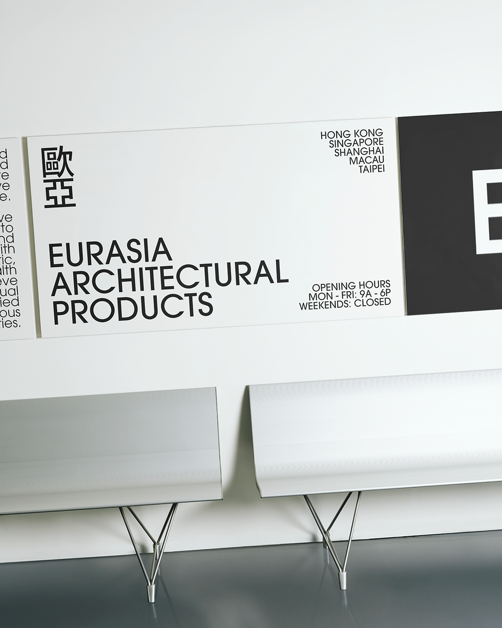
Eurasia Architectural Products is a construction industry company that supplies acoustic and stretch ceilings. The brand accompanies architects and designers in their quest for aesthetics. In alignment with their strategic expansion from Greater China into Singapore, we evolved their brand identity to embrace a broader Southeast Asian context, ensuring our visual and verbal narrative resonated within a more interconnected global landscape.

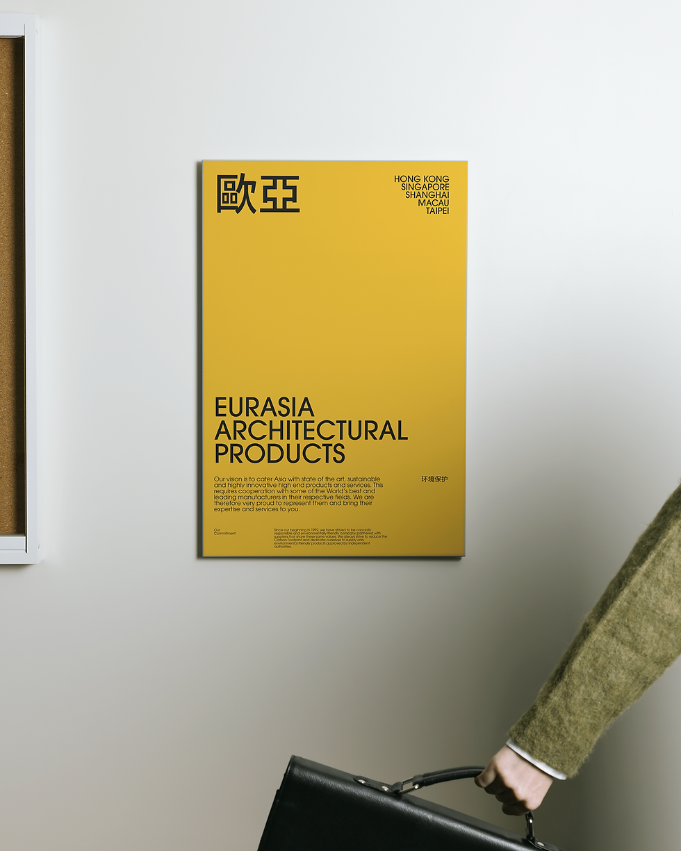

The name Eurasia serves as a linguistic portmanteau of Europe and Asia, honouring the dual heritage of its founders. This cultural synthesis is woven into the brand’s visual DNA through the recurring use of the Chinese characters 歐亞. Functioning as a rhythmic design motif, these characters pay homage to the brand’s Chinese roots while anchoring its identity within a modern, global context.

The brand’s evolution honours its roots by center-staging the traditional palette of red and yellow, colours deeply synonymous with vitality and success in Chinese culture. By transitioning these tones from subtle highlights to primary drivers of the visual language, the brand achieves a more visceral and impressionable presence. This shift signifies a move toward a more confident, expansive way of engaging with a global audience.


The Eurasia logo is rendered in the clean, geometric profiles of ITC Avant Garde Gothic to command the visual field. This deliberate typographic choice echoes the fundamental elements of architectural design: straight lines and perpendicular angles. This evokes an inherent sense of stability and professional meticulousness.


Eurasia’s brand identity is defined by a commitment to simplicity, utilising streamlined wordmarks to communicate with clarity. By emphasising white space and minimal ornamentation, we created a high-clarity visual language that mirrors the brand's focus on precision. This simplicity is engineered for versatility: designed to be impactful enough to stand alone, yet neutral enough to complement partner brands without causing visual friction.
