
The Airline That Made Red Feel Personal
- Nathanael Lim

- Nov 11, 2025
- 4 min read
This one started with an Instagram post from a year ago, where Tony Fernandes wrote about losing his mum and how that moment shaped his mission to make air travel accessible, and it hit a nerve. Then he deactivated his socials, citing scams and fake news, and for a moment I thought I’d imagined it. Thankfully, the post still lives on LinkedIn, proof that the story wasn’t something I dreamt up.
It’s uncommon for a founder’s personal loss to shape an entire company, and even more uncommon for that emotion to shift an industry. The timing makes it feel even more striking. Jetstar has just pulled out of Singapore, and it brings back the memory of my first flight as a kid on TigerAir, that tiger-print tail and the simple excitement of going somewhere. Low-cost carriers reshaped not just how we travel, but what travel means. And leading that shift in the most stylish, self-assured way possible, is AirAsia.

This is branding that begins with purpose and grows through culture. It shows up in Tony’s story, in their signature red, and in the Allstars who bring that belief into the everyday. Every layer of AirAsia’s brand feels considered and intentional.
Tony’s Why


He was studying in England when his mum passed away, and he couldn’t afford the flight home. Airfares were unforgiving at the time and flying felt reserved for the privileged. That moment stayed with him and eventually grew into a mission. As he puts it, “That’s when my dream started, to build an airline that could fly everyone, anywhere, anytime, at a very cheap price”.
AirAsia came out of a personal story rather than a market opportunity. A moment of grief became the company’s guiding idea, and that depth is a big part of why the brand resonates. Many low-cost carriers focus on efficiency or volume, and you can sense that on board. Some make you feel like you paid for the discount with your dignity. AirAsia takes a different route. Their tagline, “Now Everyone Can Fly”, may sound witty, but it reflects a belief that runs through the organisation. When a founder’s story is carried with conviction, it becomes the culture.

There is something to learn from Tony’s story. Step away from the competitor analysis for a moment and return to the reason you started in the first place. It does not need to be noble, but it does need to be honest. “To make money” will never hold on its own. The real reason you exist is what draws in the people who want to build with you and the customers who choose you. No spreadsheet can capture that.
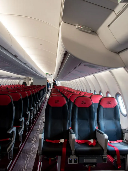
AirAsia Red
You see it long before you step on board. That bold, warm shade of red that shows up on the aircraft tail, on the uniforms, and almost everywhere the brand appears. AirAsia chose it with intention and it became their signature.

What I love is how the colour holds two layers of meaning. It matters to the region they serve, where red is associated with celebration and good fortune. AirAsia pulled from that cultural shorthand and turned it into a symbol of care, passion, and fun. It feels rooted in Southeast Asia yet still speaks across borders, something you recognise without needing to read the name. Over time, it acts as a memory cue, and years of consistency have turned that cue into trust.


Every brand carries a few words or feelings that sit quietly behind it, the traits you hope people associate with you. The right colour can express those ideas long before language catches up. Our brains respond to it instinctively. With enough repetition, the colour stops functioning as decoration and starts working as a signal, a feeling people recognise even if they cannot explain it.
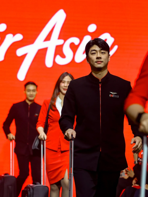
Allstars Culture
They aren’t called staff. They’re known as Allstars, and that small shift in language sets the tone. It tells every pilot, crew member, and technician that they are part of the performance, not an afterthought. It signals that they are not just a number in the system but a living part of the brand.

You can see the effect in day-to-day interactions. When people inside the organisation feel recognised, the guest experience changes with them. A smile feels genuine rather than rehearsed, and even the line “Now Everyone Can Fly” lands (pun intended) because the people saying it believe in what it represents.
The real work begins long before the customer steps on board. When employees feel proud of what they stand for, customers notice without needing to be told. The brand moves through tone, through small moments of care, long before it shows up in a campaign. Culture becomes the system that holds every promise in place.
AirAsia may not get everything right, yet it manages to feel strangely personal. The brand holds on to a clear idea of what it exists to do, and that sense of connection threads through everything. You see it in Tony’s story, in the red that reads as home across the region, and in the Allstars who embody what the brand stands for. Each part of the experience circles back to the same belief.
Maybe that's the real lesson here. The strongest brands scale through consistency, not campaigns. They build worlds that people want to belong to and make you forget it was ever just about flying.

Comments