
The Design Shifts That Will Matter in 2026
- Nathanael Lim

- Jan 30
- 5 min read
Design in 2026 is shaped by a series of quieter shifts in how meaning is constructed, felt, and judged. After years of acceleration, optimisation, and visual excess, there is a growing recalibration underway.
The shifts outlined here are not predictions in the trend-report sense. They are observations drawn from how brands, creatives, and audiences are responding to a world that feels increasingly saturated and difficult to read. Across these shifts, a shared sensibility emerges. Design is becoming more grounded and more attuned to human experience.
Through interfaces that engage the body as much as the eye, visual languages that favour play and emotional relief, atmospheres shaped by movement and mood, a more disciplined relationship with generative tools, and a renewed acceptance of imperfection as a form of authorship. Together, these shifts sketch a design landscape that prioritises presence and judgement.
Embodied Interfaces
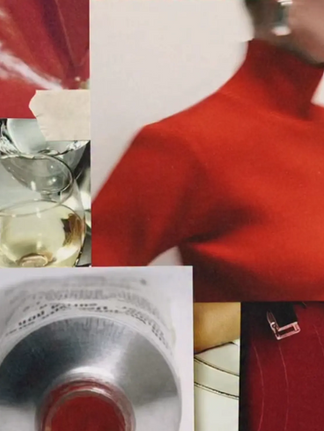
Embodied Interfaces reflect a shift towards design as something to be registered rather than simply observed. Increasingly, brands and spaces are building meaning not just through form or image, but through texture and material choice, drawing on bodily experiences that feel immediately familiar even when presented in unexpected ways.


Much of this work relies on association rather than explanation. Beauty and fashion brands, including Rhode, have leaned into sensory cues that reference everyday rituals and physical experiences, using warmth, tactility, and domestic familiarity to extend their narratives beyond the purely visual. In parallel, Jacquemus has consistently staged surreal interpretations of ordinary objects and environments at architectural scale, turning recognisable forms into experiential anchors rather than decorative backdrops.
What distinguishes Embodied Interfaces from earlier forms of experiential design is restraint. Familiar sensations are subtly reframed, using the ordinary as a shortcut to emotional connection. The experience feels grounded precisely because it borrows from things people already know how to feel, allowing meaning to emerge through recognition.
Playful Reduction
Playful Reduction sits at an interesting intersection between attention and relief. The visual logic is obvious, our brains are wired to notice bright, saturated colours, and in a landscape shaped by endless scrolling, these colours cut through the noise. Sticker-like graphics, bold shapes, and simplified compositions stops the scroll.


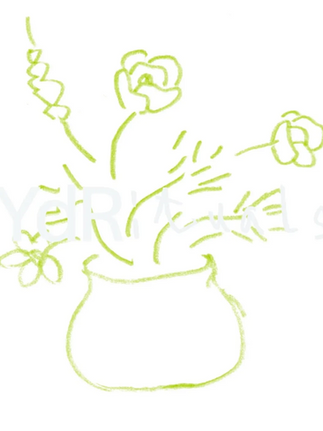
As rule-based order in geopolitics continues to fracture, there is a broader cultural appetite for things that feel simpler and more emotionally legible. Play start to function as a form of visual refuge. Playful Reduction reflects this mood by deliberately stepping away from visual seriousness. The compositions often feel casual, borrowing from sticker books, early digital games, and naïve graphic language, but the reduction is intentional rather than careless.
As a design shift, Playful Reduction is less about chasing attention through brightness alone and more about recognising why attention is fragile in the first place. In uncertain environments, visual play becomes a way to communicate warmth and presence without pretending everything is under control.
Atmospheric Depth
Atmospheric Depth signals a shift in visual language away from precision and sharpness toward motion, softness, and sensory nuance. Imagery often features tactile texture, subtle motion blur, and layered focus that feels like a lived moment.


Part of this aesthetic feels tied to how we already represent movement and presence in digital life. Running communities, especially those emerging around the resurgence of run clubs, often capture their activity through motion-forward visuals. Long exposures, blurred horizons, and streaks of colour that suggest pace rather than stillness. This style becomes a visual shorthand for energy and collective experience, turning the act of movement itself into an atmospheric device.
What matters in Atmospheric Depth is not the literal blur but the emotional field it opens up. Soft focus imagery and ambient textures create work that feels dreamlike and immersive, inviting viewers into a space that feels felt. In this context, the eyes naturally carry the emotional weight because meaning accumulates around where focus settles.
Directed Intelligence
2025 was the year AI stopped being a novelty and became unavoidable. Tools flooded the market and creative output scaled at a pace that was hard to keep up with, but the speed came with a cost. There is now a shared fatigue with generative work that looks impressive at first glance yet collapses under scrutiny. The fact that “AI slop” has entered everyday language is less a critique of technology than a reaction to what happens when production outpaces judgement.


Directed Intelligence responds to that discomfort by re-centering taste as the core creative value. In practice, this means the designer’s role becomes less about producing material and more about shaping it.
There is an ethical undercurrent here as well, one that established creatives are increasingly unwilling to ignore. Questions around consent and originality are forcing a more deliberate approach to how these tools are used, beyond whether they are used at all. Quiet integration allows for accountability, making it easier to explain decisions and demonstrate intent rather than hiding behind automation.
New Ugly
New Ugly can be read as a response to a moment where sleek minimalism and perfect polish no longer feel as meaningful as they once did. Rather than abandoning craft or order, New Ugly makes decision-making visible. Crowded compositions, uneasy typographic hierarchies, and uneasy visual tension are not mistakes, but evidence that someone chose where to stop.


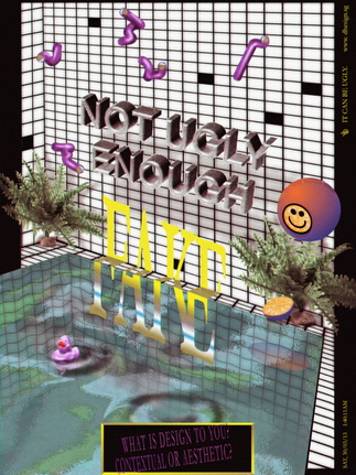
The renewed relevance of this language reflects a broader desire to confront refinement that signals competence without personality. What feels rough or unfinished is actually deliberate, a way to challenge assumptions about what good design should look and feel like, and to make visible the human labour underneath the surface.
In this sense, New Ugly sits alongside the other trends in this list not as a return to chaos for its own sake, but as a way of foregrounding judgement where automation and predictability have begun to dominate. For a deeper exploration of what New Ugly really says about contemporary design practice read our full essay on What the New Ugly Says About Design Right Now.
Taken together, these shifts point to a broader reorientation in design practice. Judgement and emotional resonance are taking on greater significance as creative output continues to scale. Whether through sensory cues, visual play, atmospheric mood, restrained use of technology, or deliberate imperfection, the work that resonates in 2026 is work that acknowledges the conditions it operates within.
Across Embodied Interfaces, Playful Reduction, Atmospheric Depth, Directed Intelligence, and New Ugly runs a growing confidence in slowing down, making decisions visible, and trusting audiences to engage through feeling as much as interpretation. In a landscape shaped by automation and noise these shifts suggest that design’s relevance lies in creating moments of presence and intent.

Comments